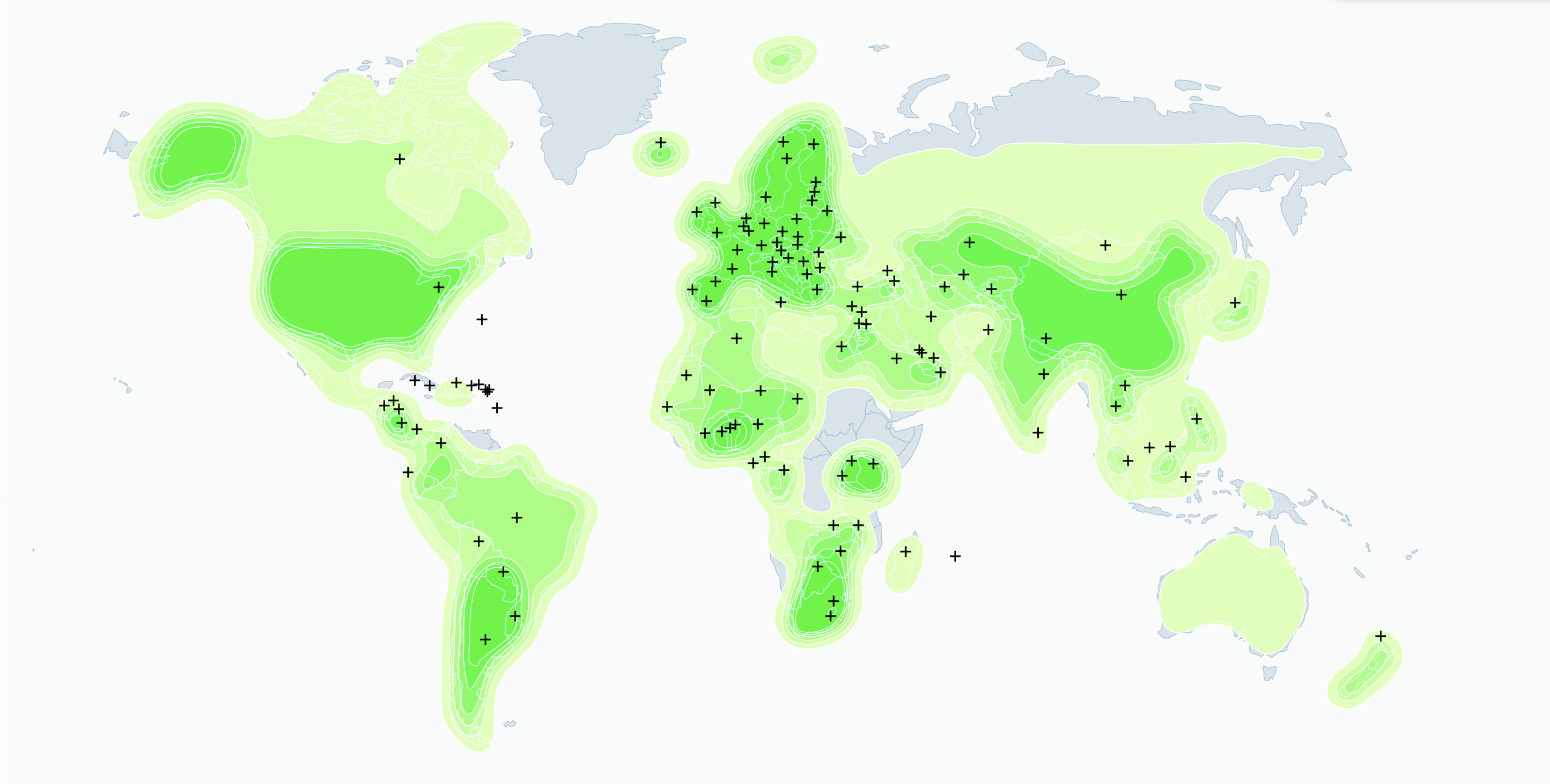
Dynamic contour map with point density estimation
A data visualization for time-dependent geographical data that represents quantities associated to countries as more or less dense clouds, implemented in React and d3.
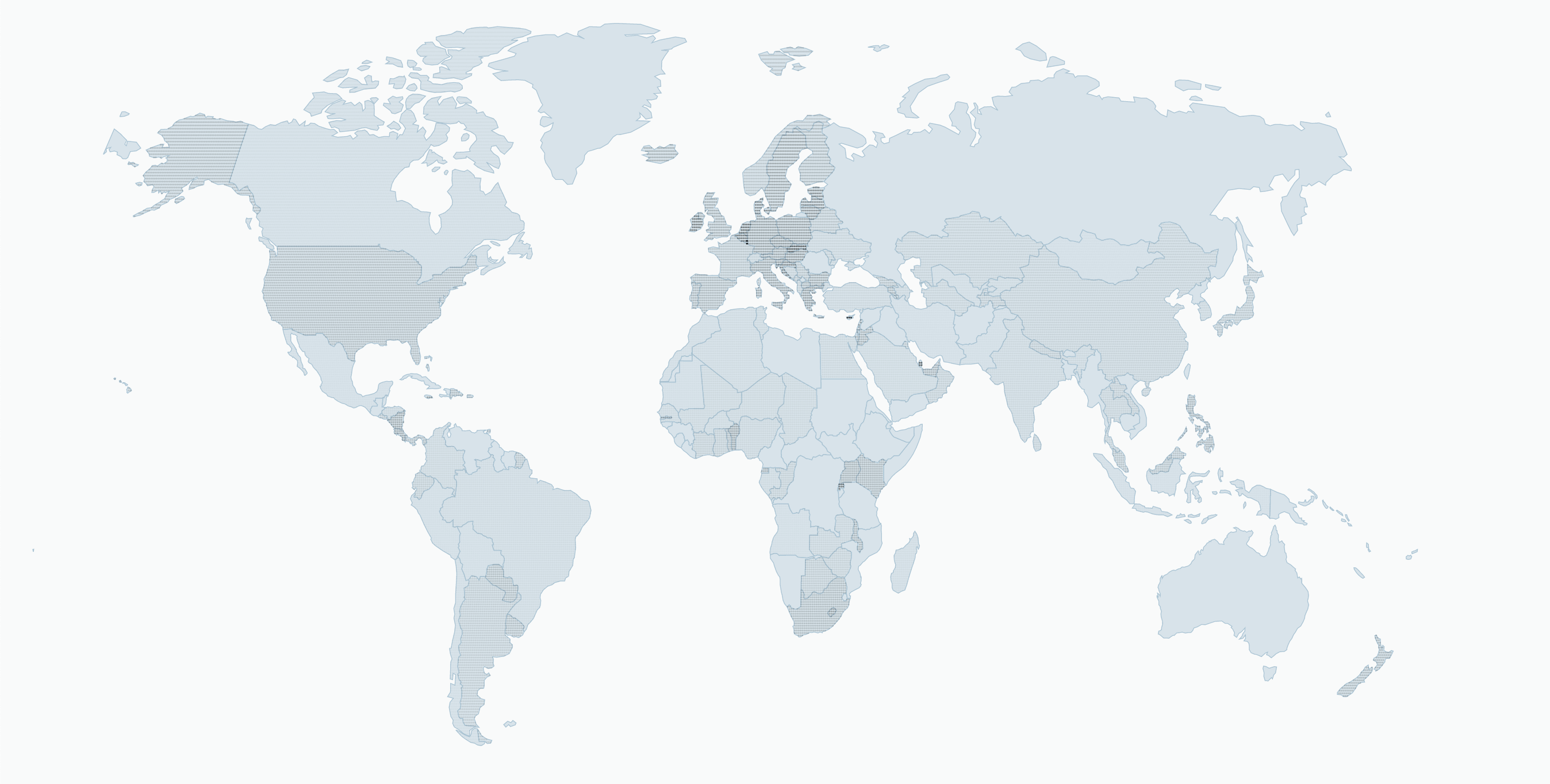
Although it is less accurate than a choropleth map, this visualization might be more interesting for communication purposes (for example dealing with topics that have a immaterial nature, like internet) or for datasets that aren’t necessarily restricted by political borders.
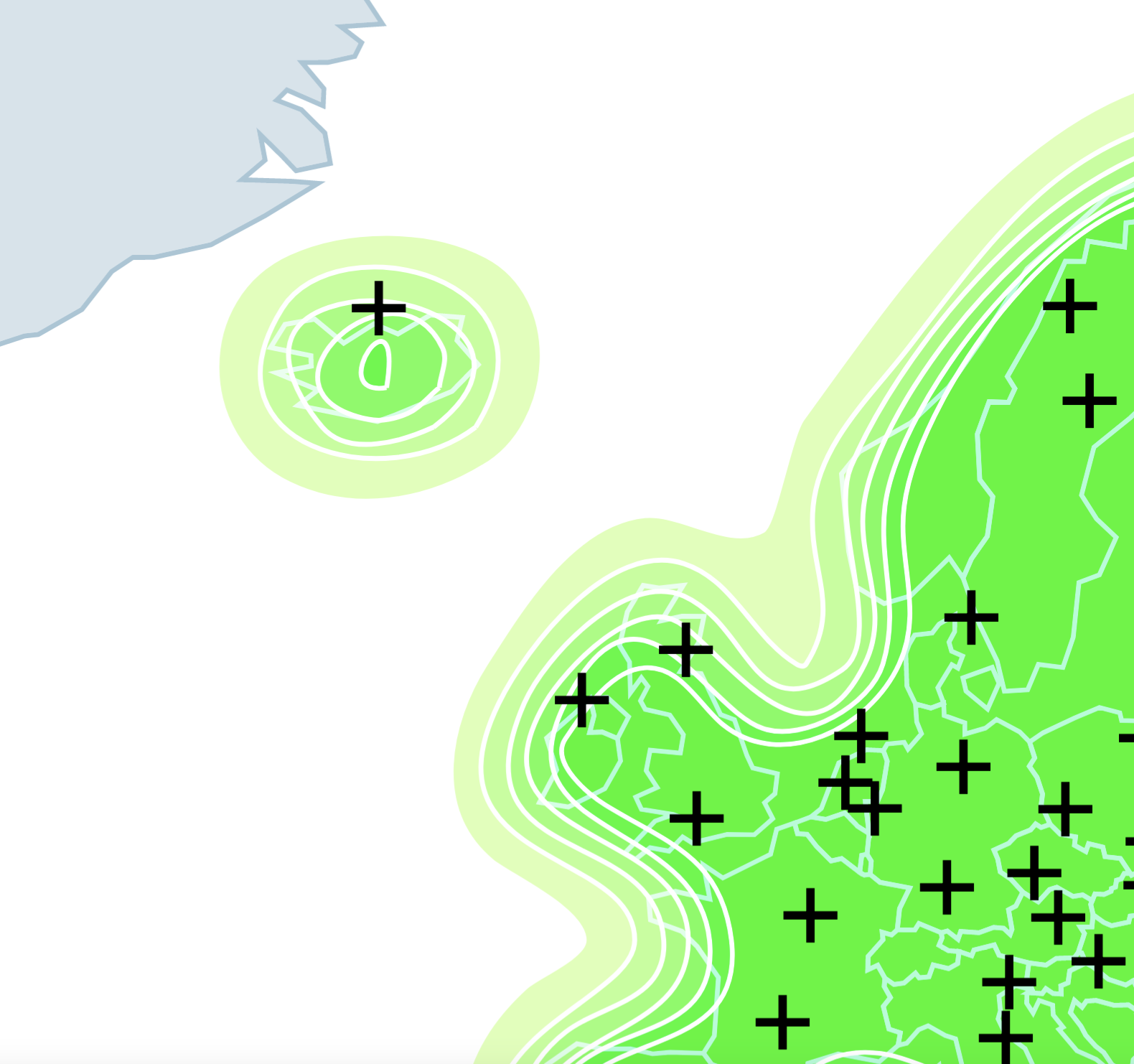
It is built leveraging the powerful point density estimation of d3-contour.
Geographical data is transposed to a grid of points: each has a weight proportional to the value associated to the country containing that point, normalized by the area of the country itself. This is equivalent to creating replicas of each point in a proportional number to such value.
The density estimation algorithm does the rest, interpolating the points in the most fitting shape, and representing it with contours.
On a computational level, the process of generating a dense grid of points, each with its weight, and to apply density estimation at each timeframe, is still too heavy to be performed on the go. A solution consists in transforming all data into the desired contours and saving them as SVGs, that are loaded with the page. This is suitable for static datasets.
The change from one to another with the help of a slider is finally snappy. To gain some extra speed, the rounded shapes of the contours are processed with the help of a path-simplification algorithm from Paper.js.